
Wednesday, November 24, 2010
Task 2 - post - Zeniviroments

Task 9 - Timeline Styles
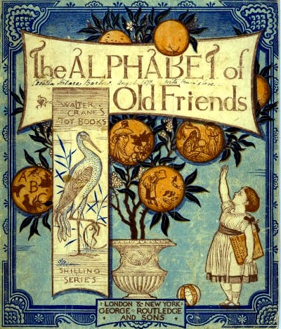
Victorian

- Victorian romantised design style
- Banner Victorian style heading
- Bright vibrant use of colour
- symmetrical layout
- large amount of detail
Arts & Crafts

- Detailed illustration style
- Well constructed curved typography style
- Organic look and feel (Victorian style)
- Bold use of colourArt Nouveau

- Curved and natural shapes used in the design
- Asian style influence
- strong black outline
- image makes reference to the women common theme
in Art Nouveau period
Early Modern

- Flat colour approach but eye catching aswell
- Sense of rebellion
- Figures are symmetrical
- strong use of the colour red
Art Deco

- Geometric design layout
- overlapping layers
- unique typography style
- use of many different typography designs.
American Kitsch

- exaggerated pose (heroic realism)
- Bright vibrant use of colour
- theme of women more accepted with work
Late Modern

- Quirky but stand out text
- simplicity in style
- Simple illustration
Swiss International

- Simple use of typography
- Geometric based layout
- use of perspective
Psychedelia

- illegible typography
- large and vibrant imagery
- no use of the colour black
Contemporary

- use of simple stand out text
- plain black and white imagery
Digital

- vibrant and bold use of colour
- Large and in exaggerated text
Task 2 - post - Nike Logo

Tuesday, November 23, 2010
Task 5 Trade Magazine - Desktop
Desktop Magazine looks to bring the latest in the design world. Graphic design, illustration and film are the three pillars it stands for. The magazine focuses on the lastest design solutions and designers, bringing inspiration to aspiring designers and certainly established designers themselves.


One of my favourite article found in Desktop Magazine was the insight look into into the Illustartor and typographer Peter Hoffman - Inside the Glaushaus. I was draw to this article as i loved Peter Hoffmans insanely deatiled illustration style and looked to his work as inspiration. The article explores his Hoffmans journey from his studies back home in Germany to his success as freelance designer in the US. Hoffman talks about working under his Glaushaus design banner and sights the particular motion that design provides him with as his motivation.
Monday, November 8, 2010
Task 2 - post - Shirt Design

T shirt Design made in dedication to music artist Kanye West, I like the use of colour in the shirt design, the design stands out and its hard to miss. One of the elements i admire in a design is the level of detail so i appreciate this deisgn for that reason. I like the Illustration style its cartoon style but show depth and tone.
Task 2 - post - Ken Taylor

Sunday, September 19, 2010
Task 6 Design Studio - The Keystone Design Union

Starting out in 2003, The Keystone Design Union strives to recognize and unite the worlds top creative talent. Their goal is to bring together the most accomplished Creative Professionals; established and emerging Artists and Designers, Photographers, Marketing and Communications among others to create and become the leaders in design. KDU works great as a source of inspiration as they introduce u to many designers aswell as show u an insight into the buisness with case studies and developemnet into their work.
Marc Ecko worked personally with the KDU to develop a wide variety of identities and concepts for his global fashion empire. Everything from apparel to fragrances were addressed and visually explored.


Subscribe to:
Posts (Atom)